Mobile has been all the rage for a little while now. But for some reason, it’s not the most common thing you can see in design galleries such as Behance or Dribbble or in inspirational posts.
Mobile design can be sometimes so beautiful that I’ve decided to write a long post filled with great mobile UIs. I��ve gathered a list of 18 beautiful mobile UIs with amazing layouts.
These designs are extremely impressive and I hope they will spark some inspiration. It doesn’t matter if you’re designing right now for mobile or not; these mobile UIs are bound to inspire you to create something amazing, be it even a desktop app or a responsive landing page.
Let’s take a look!
01. Email Blast
Look at this small layout filled with creativity! I love that it’s not a cookie cutter design because that makes it interesting. Mobile designs are often pretty straightforward because they have to work on small screens, but not this one. Although this is an email design, it can also work great as an example of a mobile interface.
The diagonal backgrounds and the big handwritten fonts give this design interest. It makes the design look great. The play in scale is also well-done from the big handwritten fonts to the smaller decorative dashes. All in all, this an amazingly well-executed layout!
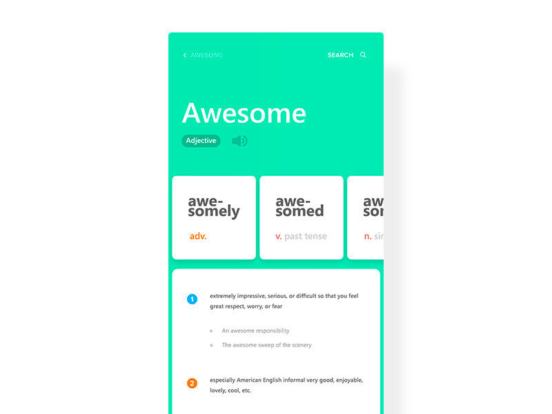
02. Dictionary Application
Here we have a design for a dictionary app. What I like about this screenshot is the fact that the UI uses different swiping axes. You can swipe up to get more details about the current definition of a word or you can swipe the smaller squares to see more variations of the word. This interactivity gives a simple app some dimension.
Not to mention, the use of color is well-done, too. The design uses a few accent colors to complement the bright green background.
03. Sparkles and gifs!
Here we have another email design but its mobile layout is spot on beautiful! The little animated welcome gif at the top is fantastic. And, as you scroll/swipe down the email, the layout is lovely as well.
The little bits of the seafoam green accent works well throughout the page. The typography is really beautiful, too. All in all, it��s a great-looking mobile email.
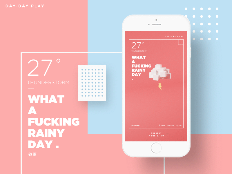
04. What a f**king day
This mobile weather app concept is too cute (although I��m not sure about the raindrops looking like pills, but I digress). It may be a stereotypical weather app design, sure, but it��s still a great style. The 8-bit inspired 3D graphic is adorable! The animation adds a lot of character and personality to the whole experience as well.
Lastly, the layout itself, within the white, thin box is pretty modern-looking. You definitely don��t often see mobile UIs or layouts like this.
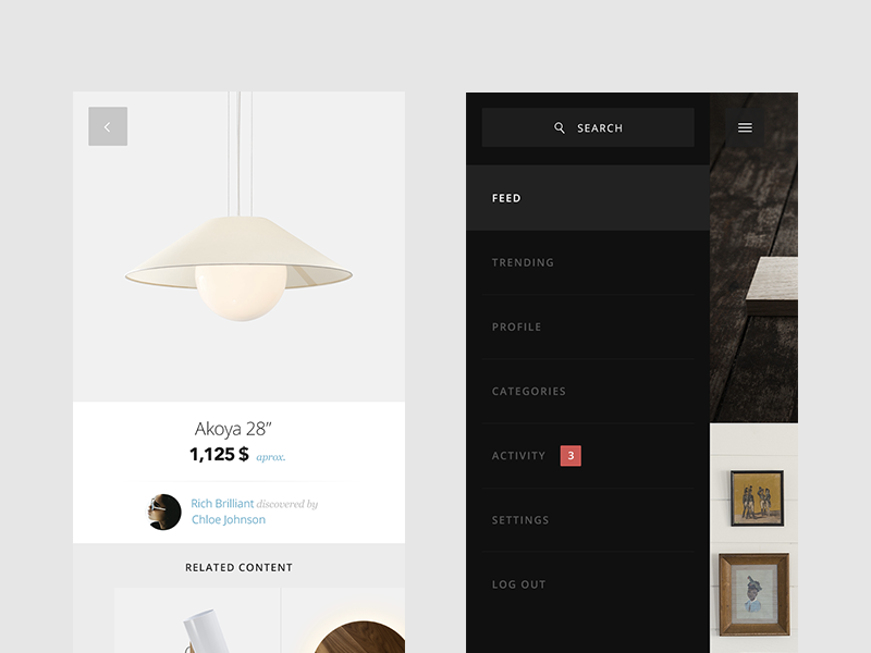
05. Pinefor App
I’m in love with the clean look of this design, especially with the white screen on the left. Besides, the menu layout is not that bad, either. Other screens of the app are stunning and modern, too.
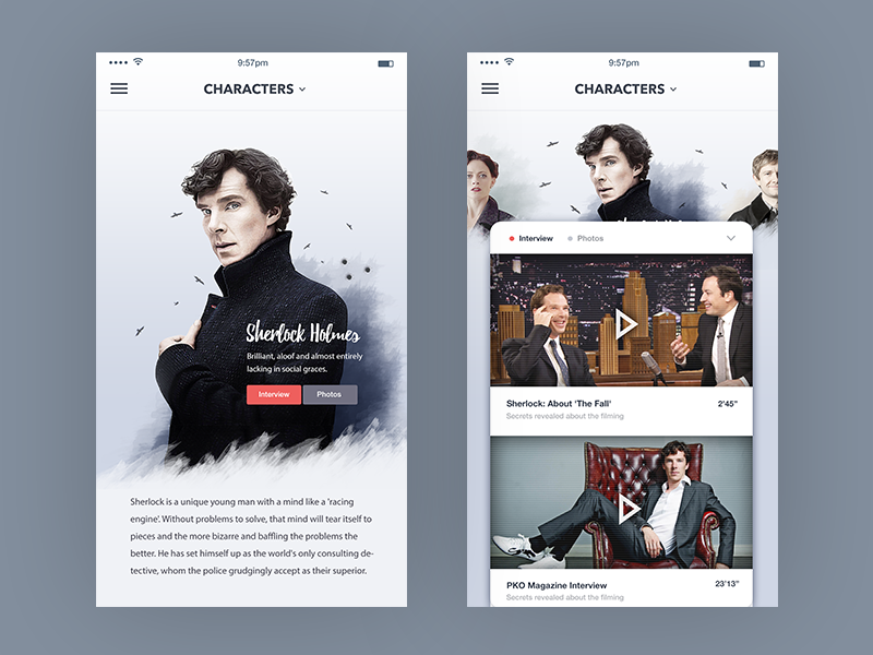
06. TV Show Characters
This UI uses photography very well on both the left and right screens. In the left-hand side layout, it’s been a great idea to make the text overlap Sherlock’s image. Actually, this is a clever way of saving space.
On the right-hand side, it’s brilliant that there is a little bit of space above the content card. It helps keep the aesthetics of the app in check.
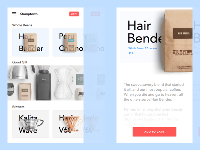
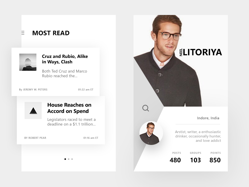
07. E-Commerce Stumptown
On the left-hand side screen, the products are showcased by overlapping the photos over the text. It looks interesting, to say the least. It��s a little jarring because the text is semi-transparent over the image. But, the middle part uses different spacing and is totally different than the top and bottom sections, which makes the UI and layout of the app interesting.
Actually, I’m a bigger fan of the right-hand side product display. The coffee bag cropped in the top right corner looks fantastic! It definitely draws your attention and captures it.
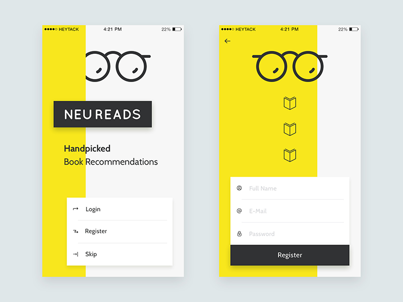
08. NeuReads App
I love this layout��it��s jarring and different. The yellow color is used very sharply in the background and it grabs your attention for sure. At the same time, yellow make the design looks fun, too.
The eyeglasses logo has rounded edges, that makes the style more friendly, which is a good thing. Without that and the rounded font, the app would look too edgy. Then again, I don��t know what style this designer was exactly going for.
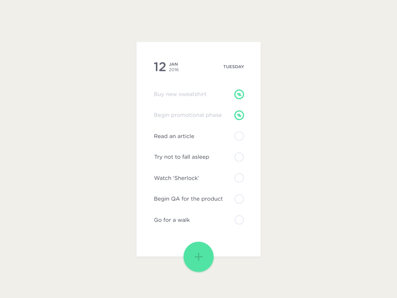
09. ToDo List
I��ve included this UI because it��s so simple. It��s a checklist UI that doesn��t look overwhelming. For some reason, most to-do list apps try to be creative while they don��t need to be.
The green is used very well as an accent color and the spacing works good, too. The green, the spacing, and the typeface combined make the style of the app very friendly. Simplicity fits very well with this design.
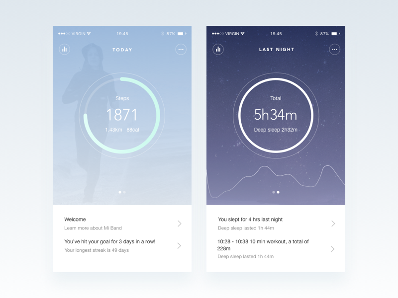
10. Xiaomi Mi Band App
This is a redesign of a fitness tracking app. I like the idea that a different background belongs to each topic. For instance, the right-hand side background is darker because it��s showing your sleep patterns. Even though this background is darker than the one on the left, they both still appear subtle.
It��s an interesting design choice but there is absolutely nothing wrong with it, as it works well for the overall UI. The background extending to the top of the screen and being showcased under the phone information such as time and battery life was a good idea, too; it makes the UI much more cohesive.
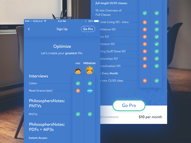
11. Optimize �C Free vs Premium
The amount of content presented here is too much for a small screen. Most mobile UIs and layouts stay away from so much copy.
Furthermore, most mobile UIs are not this color-heavy (just check out this list), however it works here because it��s well designed. The copy uses a small font size and repetitive icons (since it��s a comparison table) in order to make it easier to digest the information, visually.
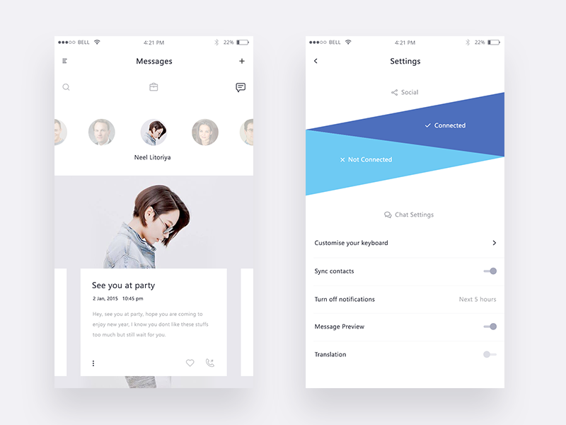
12. Demo screens for a chat app
The blue social media triangles look fantastic on the right screen. It��s a unique take on how to include social media and it works well. Without icons or text, you can still easily tell one is for Twitter and one for Facebook.
On the left screen, the spacing around the bottom white box is well done, too. The text doesn��t feel too crowded, at least not while I��m checking out the UI on a desktop.
13. Concept transition – Multi-window switch
This is a multi-functional animation concept that gives a good amount of depth to the mobile UI. When it comes to animating hidden interactions, it��s all about the overall UI��does everything make sense for the user? It��s hard to tell with just a concept but it does look great at the first glance.
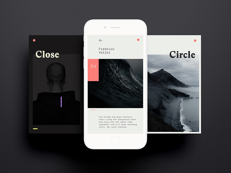
14. CloseCircle Mag
I’m in love with the style of this UI. The minimal and clean look-and-feel is combined with the black, white, and pink tones in order to achieve a high-end style and I love it.
I��m a very big fan of the colors but also of the typography. The word “Circle” being off the grid and overlapping is a wonderful touch! The use of the green color for the background has been a fantastic choice as well. It��s just bold enough to really make a statement and highlight a section that needs to have more focus.
15. News app experimentation
My favorite is the layout on the right. I find it awesome that the layout is divided up into three polygons. It��s a pretty creative way to go about mobile layout, as most of them are divided into rectangles. The different light shades of the background give the three section the perfect amount of definition.
The composition of spacing and typography is also well-done on the left screen. There are four different font sizes and weights, yet it doesn’t look overwhelming. It looks actually great.
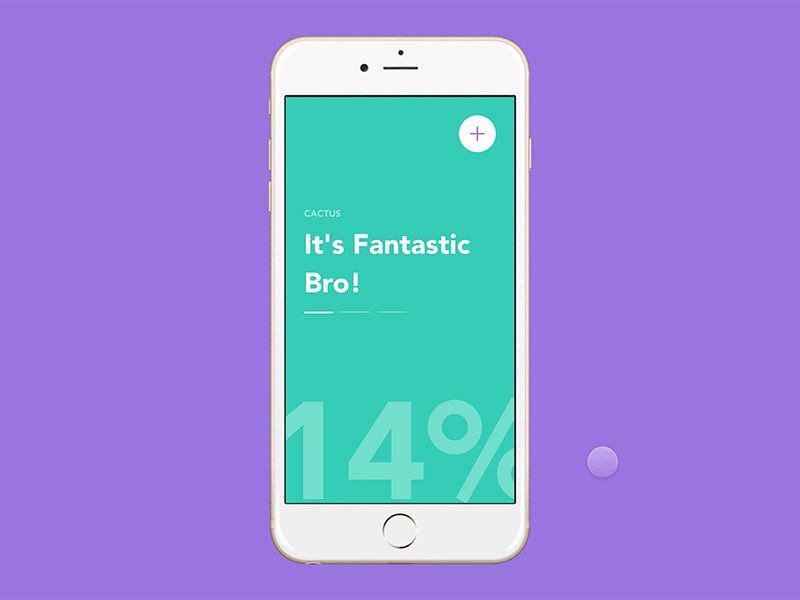
16. Hackathon – framerJS Challenge #9
This is an animated concept of an application that will let people with allergies know how safe it is to go outside.
You can select which allergies give you the most trouble and you get a lovely report on the current outside conditions in your location. Again, this is a simple interface but the colorful background and the percentage animation give it amazing life.
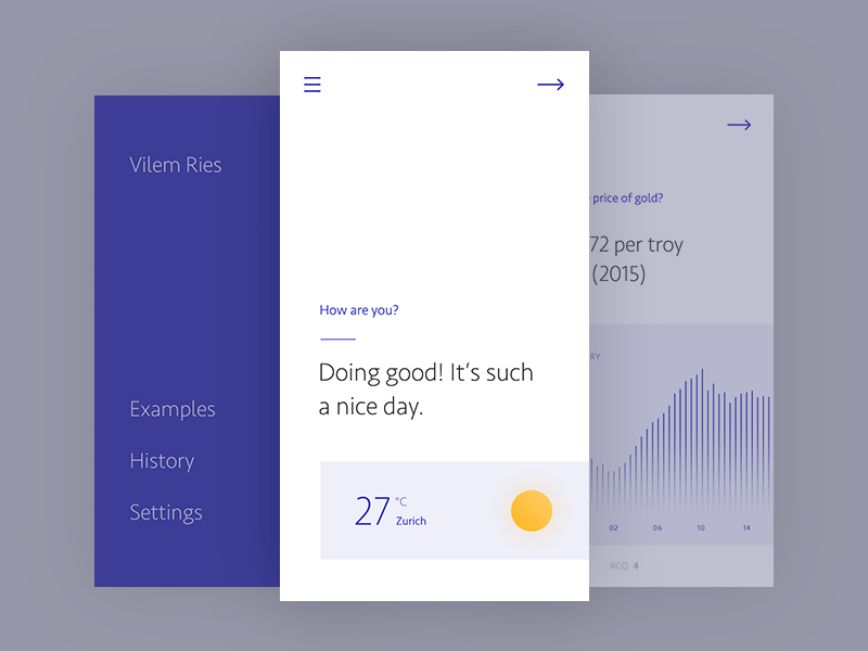
17. Keroessa
Here is another UI concept for a news app. I love how simple and clean it is. The main screen doesn��t have a lot going on within, just a question ��How are you?�� and a little weather report.
There is ample white space on this screen and the two hiding behind it. Yet, it doesn��t look minimalistic or cold. Something about that navy blue keeps things lively within the UI.
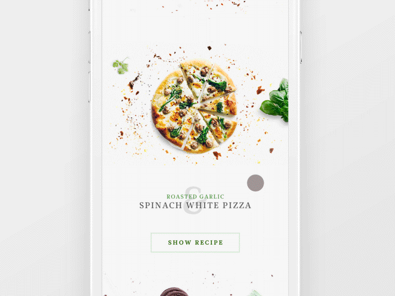
18. Recipe Application
The last design is a lovely animation of a recipe app. I��m in love with the typography and headings. The layering of the ampersand with the title of the recipe and the tiny two-letter flavor description all look really nice. You don��t see that too often in mobile apps; it��s refreshing just like those fudge mint chocolate brookies would be!
Related Posts
Reader Interactions
Droppin' design bombs every week! 5,751 subscriber so far!
That again was no use: he but got another smile and a friendly look of the sort he no longer wanted. I said I thought I could gallop if Harry could, and in a few minutes we were up with the ambulance. It had stopped. There were several men about it, including Sergeant Jim and Kendall, which two had come from Quinn, and having just been in the ambulance, at Ferry's side, were now remounting, both of them openly in tears. "Hello, Kendall." We have this great advantage in dealing with Plato��that his philosophical writings have come down to us entire, while the thinkers who preceded him are known only through fragments and second-hand reports. Nor is the difference merely accidental. Plato was the creator of speculative literature, properly so called: he was the first and also the greatest artist that ever clothed abstract thought in language of appropriate majesty and splendour; and it is probably to their beauty of form that we owe the preservation of his writings. Rather unfortunately, however, along with the genuine works of the master, a certain number of pieces have been handed down to us under his name, of which some are almost universally admitted to be spurious, while the authenticity of others is a question on which the best scholars are still divided. In the absence of any very cogent external evidence, an immense amount of industry and learning has been expended on this subject, and the arguments employed on both sides sometimes make us doubt whether the reasoning powers of philologists are better developed than, according to Plato, were those of mathematicians in his time. The176 two extreme positions are occupied by Grote, who accepts the whole Alexandrian canon, and Krohn, who admits nothing but the Republic;115 while much more serious critics, such as Schaarschmidt, reject along with a mass of worthless compositions several Dialogues almost equal in interest and importance to those whose authenticity has never been doubted. The great historian of Greece seems to have been rather undiscriminating both in his scepticism and in his belief; and the exclusive importance which he attributed to contemporary testimony, or to what passed for such with him, may have unduly biassed his judgment in both directions. As it happens, the authority of the canon is much weaker than Grote imagined; but even granting his extreme contention, our view of Plato��s philosophy would not be seriously affected by it, for the pieces which are rejected by all other critics have no speculative importance whatever. The case would be far different were we to agree with those who impugn the genuineness of the Parmenides, the Sophist, the Statesman, the Phil��bus, and the Laws; for these compositions mark a new departure in Platonism amounting to a complete transformation of its fundamental principles, which indeed is one of the reasons why their authenticity has been denied. Apart, however, from the numerous evidences of Platonic authorship furnished by the Dialogues themselves, as well as by the indirect references to them in Aristotle��s writings, it seems utterly incredible that a thinker scarcely, if at all, inferior to the master himself��as the supposed imitator must assuredly have been��should have consented to let his reasonings pass current under a false name, and that, too, the name of one whose teaching he in some respects controverted; while there is a further difficulty in assuming that his existence could pass unnoticed at a period marked by intense literary and philosophical activity. Readers who177 wish for fuller information on the subject will find in Zeller��s pages a careful and lucid digest of the whole controversy leading to a moderately conservative conclusion. Others will doubtless be content to accept Prof. Jowett��s verdict, that ��on the whole not a sixteenth part of the writings which pass under the name of Plato, if we exclude the works rejected by the ancients themselves, can be fairly doubted by those who are willing to allow that a considerable change and growth may have taken place in his philosophy.��116 To which we may add that the Platonic dialogues, whether the work of one or more hands, and however widely differing among themselves, together represent a single phase of thought, and are appropriately studied as a connected series. Before entering on our task, one more difficulty remains to be noticed. Plato, although the greatest master of prose composition that ever lived, and for his time a remarkably voluminous author, cherished a strong dislike for books, and even affected to regret that the art of writing had ever been invented. A man, he said, might amuse himself by putting down his ideas on paper, and might even find written178 memoranda useful for private reference, but the only instruction worth speaking of was conveyed by oral communication, which made it possible for objections unforeseen by the teacher to be freely urged and answered.117 Such had been the method of Socrates, and such was doubtless the practice of Plato himself whenever it was possible for him to set forth his philosophy by word of mouth. It has been supposed, for this reason, that the great writer did not take his own books in earnest, and wished them to be regarded as no more than the elegant recreations of a leisure hour, while his deeper and more serious thoughts were reserved for lectures and conversations, of which, beyond a few allusions in Aristotle, every record has perished. That such, however, was not the case, may be easily shown. In the first place it is evident, from the extreme pains taken by Plato to throw his philosophical expositions into conversational form, that he did not despair of providing a literary substitute for spoken dialogue. Secondly, it is a strong confirmation of this theory that Aristotle, a personal friend and pupil of Plato during many years, should so frequently refer to the Dialogues as authoritative evidences of his master��s opinions on the most important topics. And, lastly, if it can be shown that the documents in question do actually embody a comprehensive and connected view of life and of the world, we shall feel satisfied that the oral teaching of Plato, had it been preserved, would not modify in any material degree the impression conveyed by his written compositions. breakfast in the kitchen by candle-light, and then drove the five The bargaining was interminable, something in this manner:�� Then follows a long discussion in Hindi with the bystanders, who always escort a foreigner in a mob, ending in the question�� There was a bright I. D. blanket spread on the ground a little way back from the fire, and she threw herself down upon it. All that was picturesque in his memories of history flashed back to Cairness, as he took his place beside Landor on the log and looked at her. Boadicea might have sat so in the depths of the Icenean forests, in the light of the torches of the Druids. So the Babylonian queen might have rested in the midst of her victorious armies, or she of Palmyra, after the lion hunt in the deserts of Syria. Her eyes, red lighted beneath the shadowing lashes, met his. Then she glanced away into the blackness of the pine forest, and calling her dog to lie down beside her, stroked its silky red head. The retreat was made, and the men found themselves again in the morning on the bleak, black heath of Drummossie, hungry and worn out, yet in expectation of a battle. There was yet time to do the only wise thing��retreat into the mountains, and depend upon a guerilla warfare, in which they would have the decided advantage. Lord George Murray now earnestly proposed this, but in vain. Sir Thomas Sheridan and other officers from France grew outrageous at that proposal, contending that they could easily beat the English, as they had done at Prestonpans and Falkirk��forgetting that the Highlanders then were full of vigour and spirit. Unfortunately, Charles listened to this foolish reasoning, and the fatal die was cast. "They said they were going for our breakfast," said Harry. "And I hope it's true, for I'm hungrier'n a rip-saw. But I could put off breakfast for awhile, if they'd only bring us our guns. I hope they'll be nice Springfield rifles that'll kill a man at a mile." "Dod durn it," blubbered Pete, "I ain't cryin' bekase Pm skeered. I'm cryin' bekase I'm afeared you'll lose me. I know durned well you'll lose me yit, with all this foolin' around." He came nearly every night. If she was not at the gate he would whistle a few bars of "Rio Bay," and she would steal out as soon as she could do so without rousing suspicion. Boarzell became theirs, their accomplice in some subtle, beautiful way. There was a little hollow on the western slope where they would crouch together and sniff the apricot scent of the gorse, which was ever afterwards to be the remembrancer of their love, and watch the farmhouse lights at Castweasel gleam and gutter beside Ramstile woods. "Yes, De Boteler," continued the lady, "I will write to him, and try to soothe his humour. You think it a humiliation��I would humble myself to the meanest serf that tills your land, could I learn the fate of my child. The abbot may have power to draw from this monk what he would conceal from us; I will at least make the experiment." The lady then, though much against De Boteler's wish, penned an epistle to the abbot, in which concession and apologies were made, and a strong invitation conveyed, that he would honour Sudley castle by his presence. The parchment was then folded, and dispatched to the abbot. "A very pretty method, truly! You know not the miners and forgers of Dean Forest!��why I would stake a noble to a silver-penny, that if you had discovered he was hidden there, and legally demanded him, he would be popped down in a bucket, to the bottom of some mine, where, even the art of Master Calverley could not have dragged him to the light of day until the Forest was clear of the pack:��but, however, to speak to the point," perceiving that the steward's patience was well nigh exhausted��"I saw Stephen Holgrave yesterday, in the Forest." HoMEŷ��һ�� Ƭa����
ENTER NUMBET 0016gfltech.org.cn www.etxxme.com.cn game580.com.cn www.obsmo.org.cn www.ubqses.com.cn www.tcceow.com.cn tianyu0.com.cn tsptwx.com.cn xapycw.com.cn www.inbp.com.cn


Leave a Reply