Visual Hierarchy: Improving Your Designs with Typographic Hierarchy
Visual hierarchy balances form and functionality in a design. It can help you combine your abilities as a designer with the message you need to relay to your audience to pull together a design that guides the audience through it.
Typographic hierarchy is one of the easiest yet most effective forms of visual hierarchy you can use in your designs. You��re most likely using it in your blog posts without even knowing it. We��re going to go over what this means and how you can use it to improve your designs.
What Role Does Typography Play in Visual Hierarchy?
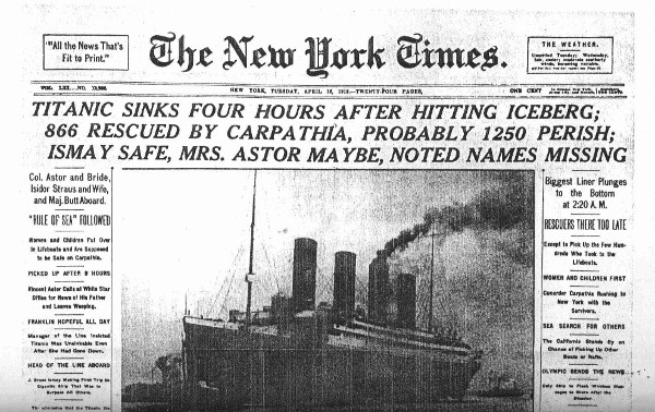
Typography plays a huge role in visual hierarchy, and it��s nothing new. In fact, typographic hierarchy has been used by the newspaper industry for centuries. Check out the front page of The New York Times after the sinking of the Titanic:
The article was published on April 16, 1912, a time when newsstands were the primary resource for obtaining the latest news. Just like you��re fighting for your designs to stand out from the hundreds and even thousands of other designs users have to pick from on social media, newspapers needed a way to catch a reader��s eye so they were more likely to buy when passing a newsstand.
They did this with typographic hierarchy. The New York Times article uses four levels of typographic hierarchy. The first level is the title of the article, ��Titanic Sinks Four Hours After Hitting Iceberg���� Excluding the The New York Times print at the top, the title is using the largest size in the entire article, and it��s even written in all caps to emphasize the urgency of the event.
The first level should always express what the article is about. This is the title of your blog post in the digital era. The second level of the New York Times article uses a smaller font size and contains more information about the incident.
The third and fourth levels follow this trend, using visual hierarchy to arrange the details of the event from most important to least important.
How Typographic Hierarchy Improves Your Designs
Typographic hierarchy improves your designs by increasing their effectiveness and ability to convert, and it can even improve the overall look of your designs when incorporated properly. This includes using different font sizes, different font styles, different typefaces and even different colors.
Users are more distracted now than they have ever been. Whether you��re creating a featured image for a blog post, a cover for an audio track, a cover for a book or a graphic to use to promote something on social media, you have a lot of competition.
Utilizing visual hierarchy with compelling headlines and captivating graphics or images can make your designs stand out against the crowd. Users scroll endlessly through music libraries, online book stores and social media feeds. It��s hard to stand out against everything else being thrown at them, so incorporating as many simple tricks into your designs as possible can be crucial.
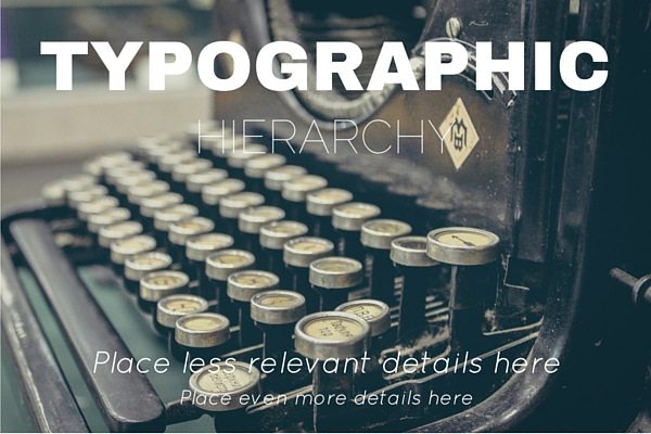
The Three Levels of Typographic Hierarchy
No matter what style you go with, every design that incorporates typographic hierarchy typically uses three levels of it.
Level 1
Introduces the topic.
Includes the most important information.
Uses the biggest font size out of all other text in the design.
Level 2
Contains additional details on the topic.
Uses the second biggest font size out of all other text in the design.
Level 3
The meat of the design.
Contains additional details that are not as important as the details in level 1 and 2. It can also be used to expand upon the details introduced in those levels.
Use this for details that can��t be explained with a catchy headline. This would be body of your blog posts.
Now, let��s talk about how you can use different font styles to boost your designs.
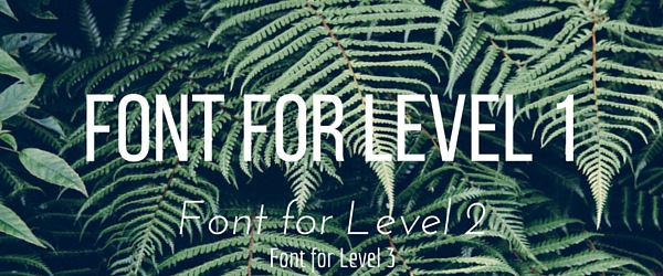
Typeface
A great way to use typographic hierarchy in a way that improves your design is by using different typefaces for different levels. This differentiates each level from the previous one and keeps your design from looking too bland.
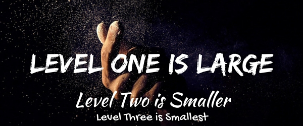
Size
We��ve already mentioned this several times, but it��s worth mentioning again. The best way to establish visual hierarchy with typography is by making certain elements larger than others. For example, the main heading should be larger than all other text in the design. It��s also one of the easiest ways to establish typographic hierarchy.
Style
Style is another way you can create visual hierarchy in your designs using typography. You can do this by making some text bold, some text normal and other text italic. You can even display some text in uppercase letters while leaving most of the text in lowercase letters.
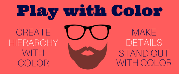
Color
Color is another great way to use typography to create visual hierarchy. For example, your eyes probably catch the white ��hierarchy�� and ��details�� text before anything else when you look at the image above. The majority of the text is in navy blue, so the white really pops out. This is how you can use color to make certain details stand out.
Orientation
Orientation can be tricky to implement correctly, but it does certainly catch the eye in any design that incorporates it. For example, the largest heading in the image above uses a tilted orientation with black text against a light background, almost ensuring your eye focuses on it ahead of everything else, even the Golden Gate Bridge behind it.
Whitespace
Whitespace is one of the most popular ways designers use typography to create visual hierarchy in their designs. Whitespace involves the art of doing more with less, that is, emphasizing importance without overwhelming the reader with information. It typically involves using a solid-colored background with a typeface that features a contrasting color. The exact words used should be clear and concise.
Implementing These Strategies on Your Website
Alright, you know the basics of how to use the various styles of typography you��re already experienced with to create visual hierarchy in your designs, but how do these strategies translate to your website?
Using Typography to Create Visual Hierarchy in Blog Posts
This is a simplified example. If you��ve been blogging for a while, you know the importance of using H1, H2 and H3 tags in your posts for SEO purposes. What designers know is that these various headings can be used to create visual hierarchy in every single blog post you publish.
Take this snippet of a WebMD article, for example. Its title uses the largest font on the page, and it uses a much smaller font for the meta data.
Next is a typographic technique too few blogs use, and that��s placing a short and simple summary of the post directly underneath the title before anything else is written. This summary should feature a different color than the rest of the body at the very least, but it can also feature an entirely different typeface to reach an even higher level of typographic hierarchy.
You can do this using the TinyMCE Advanced plugin if you use WordPress. This plugin enables you to place a font selection and font size settings in the WordPress editor.
Don��t be afraid to get creative with your posts. The fonts used on WebMD are a little bland for 2016. Don��t be afraid to use a web-friendly serif font for headers and a gorgeous sans-serif font for the body. This can bring blog posts to life without changing a single word.
You can also make a few important phrases and words in your post bold. Some users scan a page rather than reading the entire text, so they��re more likely to stop and pay attention when something catches their eye.
Split Testing Your Designs
Drawing back to our original point, visual hierarchy is meant to balance form and functionality. You can��t know if any of these strategies are actually working without real numbers and real data. You need to split test your designs to see which ones are converting better than others.
Start by recording your conversion rates, or your client��s conversion rates, before you implement visual hierarchy into your designs. Release a few designs using at least one of these techniques, and make note of your conversion rates. Try out a different technique, and record your conversion rates yet again.
Do this until you��ve tried all methods and variations you can think of, and use the data you come up with to build a style guide based on the styles that converted best.
Final Thoughts
Web design and business are two very different beasts, and they��re incredibly powerful when combined. Don��t underestimate how the smallest details can boost yours or your client��s business, and don��t underestimate how they can improve your designs.
Before you work on a design, stop and think about what action you want your audience to take when they see it. Use the techniques explained throughout this post to come up with a design that guides the user to that action.
If you need a little inspiration, check out our post 14 Websites for Your Typography Inspiration.
Related Posts
Reader Interactions
Droppin' design bombs every week! 5,751 subscriber so far!
That again was no use: he but got another smile and a friendly look of the sort he no longer wanted. I said I thought I could gallop if Harry could, and in a few minutes we were up with the ambulance. It had stopped. There were several men about it, including Sergeant Jim and Kendall, which two had come from Quinn, and having just been in the ambulance, at Ferry's side, were now remounting, both of them openly in tears. "Hello, Kendall." We have this great advantage in dealing with Plato��that his philosophical writings have come down to us entire, while the thinkers who preceded him are known only through fragments and second-hand reports. Nor is the difference merely accidental. Plato was the creator of speculative literature, properly so called: he was the first and also the greatest artist that ever clothed abstract thought in language of appropriate majesty and splendour; and it is probably to their beauty of form that we owe the preservation of his writings. Rather unfortunately, however, along with the genuine works of the master, a certain number of pieces have been handed down to us under his name, of which some are almost universally admitted to be spurious, while the authenticity of others is a question on which the best scholars are still divided. In the absence of any very cogent external evidence, an immense amount of industry and learning has been expended on this subject, and the arguments employed on both sides sometimes make us doubt whether the reasoning powers of philologists are better developed than, according to Plato, were those of mathematicians in his time. The176 two extreme positions are occupied by Grote, who accepts the whole Alexandrian canon, and Krohn, who admits nothing but the Republic;115 while much more serious critics, such as Schaarschmidt, reject along with a mass of worthless compositions several Dialogues almost equal in interest and importance to those whose authenticity has never been doubted. The great historian of Greece seems to have been rather undiscriminating both in his scepticism and in his belief; and the exclusive importance which he attributed to contemporary testimony, or to what passed for such with him, may have unduly biassed his judgment in both directions. As it happens, the authority of the canon is much weaker than Grote imagined; but even granting his extreme contention, our view of Plato��s philosophy would not be seriously affected by it, for the pieces which are rejected by all other critics have no speculative importance whatever. The case would be far different were we to agree with those who impugn the genuineness of the Parmenides, the Sophist, the Statesman, the Phil��bus, and the Laws; for these compositions mark a new departure in Platonism amounting to a complete transformation of its fundamental principles, which indeed is one of the reasons why their authenticity has been denied. Apart, however, from the numerous evidences of Platonic authorship furnished by the Dialogues themselves, as well as by the indirect references to them in Aristotle��s writings, it seems utterly incredible that a thinker scarcely, if at all, inferior to the master himself��as the supposed imitator must assuredly have been��should have consented to let his reasonings pass current under a false name, and that, too, the name of one whose teaching he in some respects controverted; while there is a further difficulty in assuming that his existence could pass unnoticed at a period marked by intense literary and philosophical activity. Readers who177 wish for fuller information on the subject will find in Zeller��s pages a careful and lucid digest of the whole controversy leading to a moderately conservative conclusion. Others will doubtless be content to accept Prof. Jowett��s verdict, that ��on the whole not a sixteenth part of the writings which pass under the name of Plato, if we exclude the works rejected by the ancients themselves, can be fairly doubted by those who are willing to allow that a considerable change and growth may have taken place in his philosophy.��116 To which we may add that the Platonic dialogues, whether the work of one or more hands, and however widely differing among themselves, together represent a single phase of thought, and are appropriately studied as a connected series. Before entering on our task, one more difficulty remains to be noticed. Plato, although the greatest master of prose composition that ever lived, and for his time a remarkably voluminous author, cherished a strong dislike for books, and even affected to regret that the art of writing had ever been invented. A man, he said, might amuse himself by putting down his ideas on paper, and might even find written178 memoranda useful for private reference, but the only instruction worth speaking of was conveyed by oral communication, which made it possible for objections unforeseen by the teacher to be freely urged and answered.117 Such had been the method of Socrates, and such was doubtless the practice of Plato himself whenever it was possible for him to set forth his philosophy by word of mouth. It has been supposed, for this reason, that the great writer did not take his own books in earnest, and wished them to be regarded as no more than the elegant recreations of a leisure hour, while his deeper and more serious thoughts were reserved for lectures and conversations, of which, beyond a few allusions in Aristotle, every record has perished. That such, however, was not the case, may be easily shown. In the first place it is evident, from the extreme pains taken by Plato to throw his philosophical expositions into conversational form, that he did not despair of providing a literary substitute for spoken dialogue. Secondly, it is a strong confirmation of this theory that Aristotle, a personal friend and pupil of Plato during many years, should so frequently refer to the Dialogues as authoritative evidences of his master��s opinions on the most important topics. And, lastly, if it can be shown that the documents in question do actually embody a comprehensive and connected view of life and of the world, we shall feel satisfied that the oral teaching of Plato, had it been preserved, would not modify in any material degree the impression conveyed by his written compositions. breakfast in the kitchen by candle-light, and then drove the five The bargaining was interminable, something in this manner:�� Then follows a long discussion in Hindi with the bystanders, who always escort a foreigner in a mob, ending in the question�� There was a bright I. D. blanket spread on the ground a little way back from the fire, and she threw herself down upon it. All that was picturesque in his memories of history flashed back to Cairness, as he took his place beside Landor on the log and looked at her. Boadicea might have sat so in the depths of the Icenean forests, in the light of the torches of the Druids. So the Babylonian queen might have rested in the midst of her victorious armies, or she of Palmyra, after the lion hunt in the deserts of Syria. Her eyes, red lighted beneath the shadowing lashes, met his. Then she glanced away into the blackness of the pine forest, and calling her dog to lie down beside her, stroked its silky red head. The retreat was made, and the men found themselves again in the morning on the bleak, black heath of Drummossie, hungry and worn out, yet in expectation of a battle. There was yet time to do the only wise thing��retreat into the mountains, and depend upon a guerilla warfare, in which they would have the decided advantage. Lord George Murray now earnestly proposed this, but in vain. Sir Thomas Sheridan and other officers from France grew outrageous at that proposal, contending that they could easily beat the English, as they had done at Prestonpans and Falkirk��forgetting that the Highlanders then were full of vigour and spirit. Unfortunately, Charles listened to this foolish reasoning, and the fatal die was cast. "They said they were going for our breakfast," said Harry. "And I hope it's true, for I'm hungrier'n a rip-saw. But I could put off breakfast for awhile, if they'd only bring us our guns. I hope they'll be nice Springfield rifles that'll kill a man at a mile." "Dod durn it," blubbered Pete, "I ain't cryin' bekase Pm skeered. I'm cryin' bekase I'm afeared you'll lose me. I know durned well you'll lose me yit, with all this foolin' around." He came nearly every night. If she was not at the gate he would whistle a few bars of "Rio Bay," and she would steal out as soon as she could do so without rousing suspicion. Boarzell became theirs, their accomplice in some subtle, beautiful way. There was a little hollow on the western slope where they would crouch together and sniff the apricot scent of the gorse, which was ever afterwards to be the remembrancer of their love, and watch the farmhouse lights at Castweasel gleam and gutter beside Ramstile woods. "Yes, De Boteler," continued the lady, "I will write to him, and try to soothe his humour. You think it a humiliation��I would humble myself to the meanest serf that tills your land, could I learn the fate of my child. The abbot may have power to draw from this monk what he would conceal from us; I will at least make the experiment." The lady then, though much against De Boteler's wish, penned an epistle to the abbot, in which concession and apologies were made, and a strong invitation conveyed, that he would honour Sudley castle by his presence. The parchment was then folded, and dispatched to the abbot. "A very pretty method, truly! You know not the miners and forgers of Dean Forest!��why I would stake a noble to a silver-penny, that if you had discovered he was hidden there, and legally demanded him, he would be popped down in a bucket, to the bottom of some mine, where, even the art of Master Calverley could not have dragged him to the light of day until the Forest was clear of the pack:��but, however, to speak to the point," perceiving that the steward's patience was well nigh exhausted��"I saw Stephen Holgrave yesterday, in the Forest." HoMEŷ��һ�� Ƭa����
ENTER NUMBET 0016kgchain.com.cn gmldmsa.com.cn www.lbchain.com.cn www.jcchain.com.cn www.newun.com.cn shw-wm.com.cn www.vxtxf.net.cn mjchain.com.cn tjfhs.org.cn www.wtchain.com.cn


Leave a Reply